Leaked Kansas basketball uniforms were met with some harsh and well-deserved criticism as they circulated Twitter throughout the afternoon.
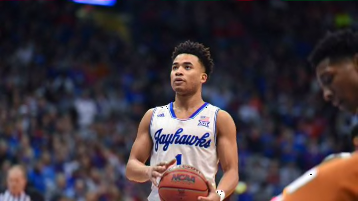
Adidas has made a lot of really cool uniforms for Kansas basketball. The cursive “Jayhawks” jersey and the circus font throwback from last season both look great, and standard uniforms from last year look good too. There are some jerseys that appeared on Adidas’ website today though that look… not great.
One uniform features a cream color background, a Jayhawk on the chest, and the number underneath. It’s so ugly, and it’s really tough to see what exactly Adidas was thinking with these ones. They’re probably meant to be alternates; however, the other kit looks like it could be a standard uniform for the Jayhawks.
The other uniform added has the curved “KANSAS” across the chest similar to the uniforms the Jayhawks have worn for most of the Bill Self era. Where it goes wrong though is the odd “collar” around the neck of the jersey. These are admittedly better than the ones with the Jayhawk logo on them, but they still aren’t good.
Currently on the Adidas website….oh boy. #KUbball pic.twitter.com/h1wiUdFxBm
— Blake Schuster (@Schustee) October 5, 2020
When it comes down to it, neither of these uniforms are improvements for Kansas, especially considering how well the Jayhawks’ standard home and away uniforms from last season were received. The good news is that neither Kansas nor Adidas have announced any changes yet for the Jayhawks’ look on the court, so there’s a chance we don’t need to worry.
Another good sign is that neither uniform was seen in the Jayhawks’ photoshoot last month. Hopefully, this was just a test for Adidas to get a reaction from the Kansas basketball fanbase. If they paid attention at all, those two uniforms would be shelved indefinitely.
