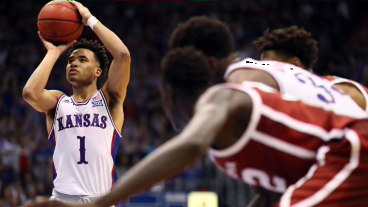
Kansas basketball wore retro ’90s uniforms against Oklahoma which received overwhelmingly positive reviews. Why not make the circus font permanent?
In one of their better offensive games of the season, Kansas basketball took down the Oklahoma Sooners yesterday 87-70. The Jayhawks looked good doing it too. To many fans’ delight, Kansas brought back a fresh take on their ’90s era uniforms.
The alternate threads were met with a positive response from the fanbase, which isn’t surprising; however, it is rare. Kansas basketball fans are generally divided along generational lines on most topics, ranging from who deserves to have their number retired to who should perform at Late Night in the Phog.
To see nearly unanimous support for the circus font to make a comeback has to mean something.
Kansas first used the circus font on their uniforms in the mid ’80 when their uniforms were created by Champion. This was the era of Danny Manning and Larry Brown, which was certainly a special time for Kansas basketball.
The circus font style would go through a number of evolutions, especially when the school switched to Nike, which could be the reason Adidas is hesitant to bring back the look.
Here’s the thing, Adidas could build a new uniform from scratch taking cues from the ’90s circus font style similar to what they did for Kansas against the Sooners. It’d be a hit with the fans without a doubt, and it probably sell well too in the KU Bookstore too.
Even if the uniforms don’t get brought back full-time though, having a ’90s alternate would be an acceptable solution. Just don’t let them fade away though, that’d be a mistake and missed opportunity.
Obviously the uniforms don’t win games, but they add to the “brand” of a team. As the old saying goes: “look good, feel good, play good.”
